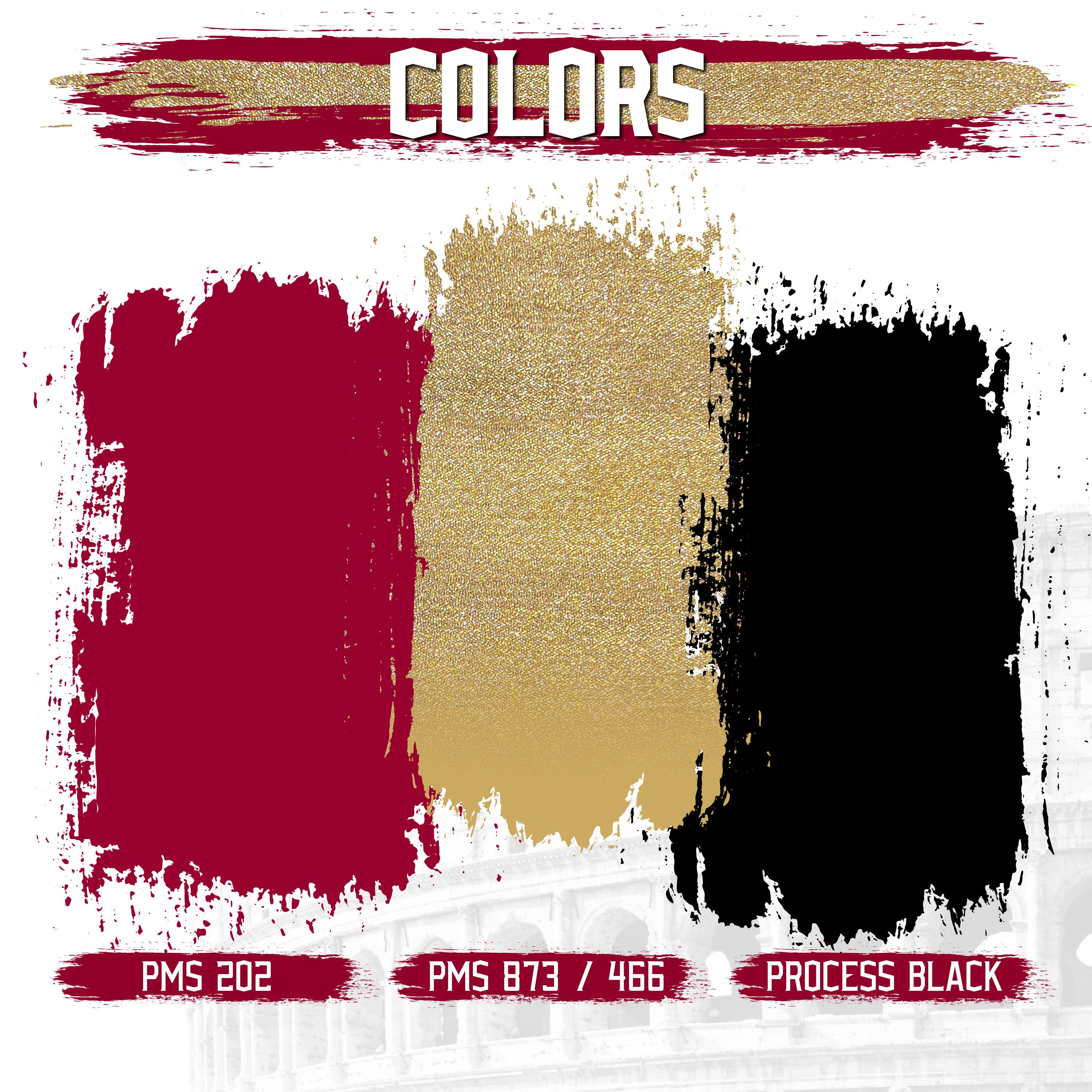
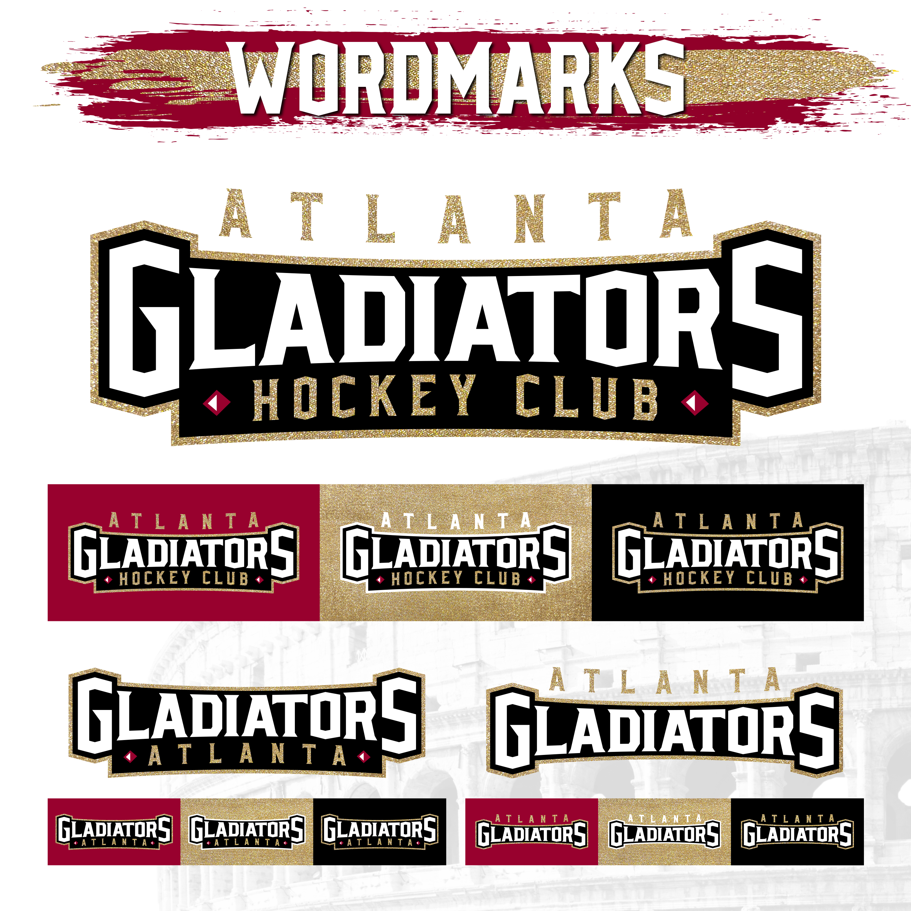
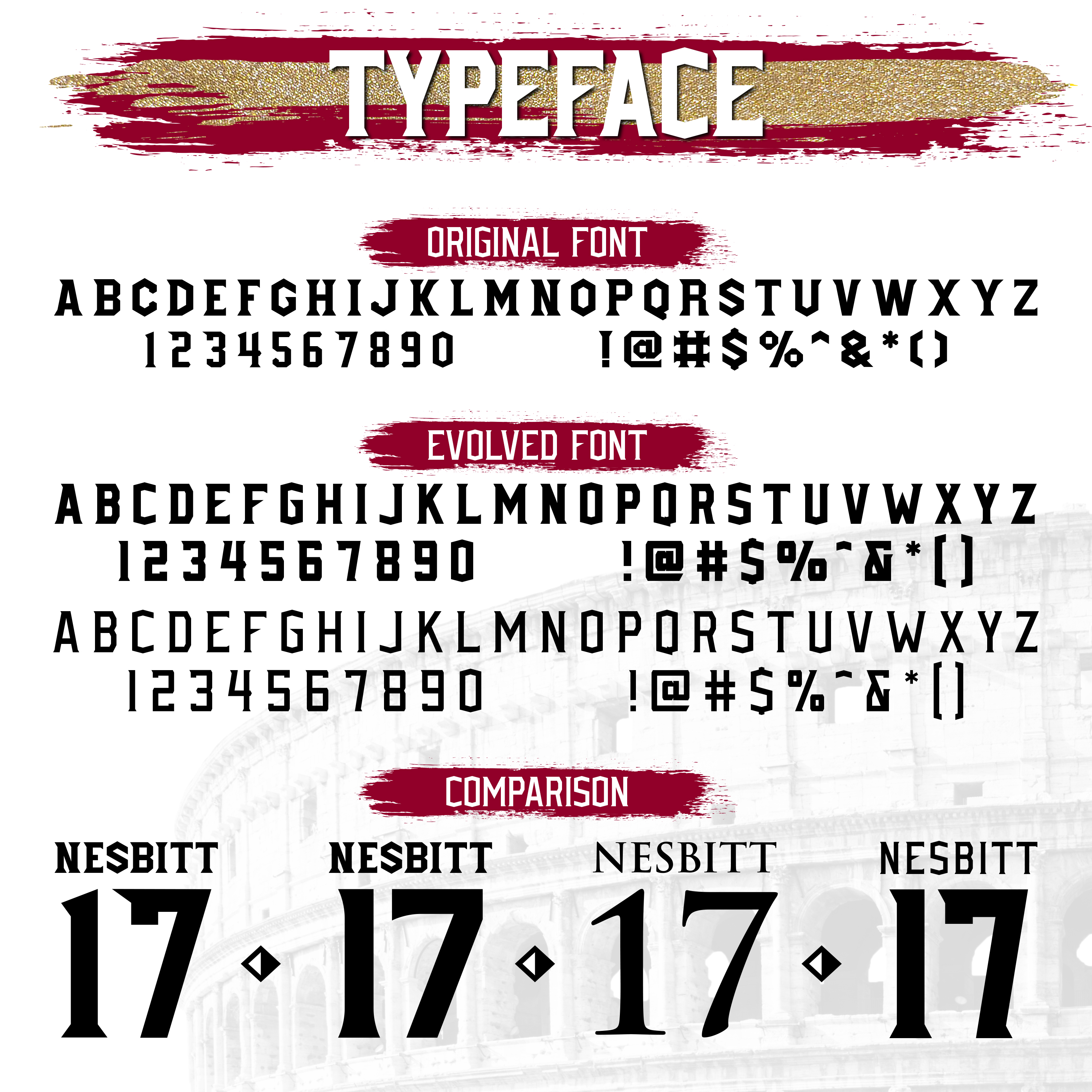
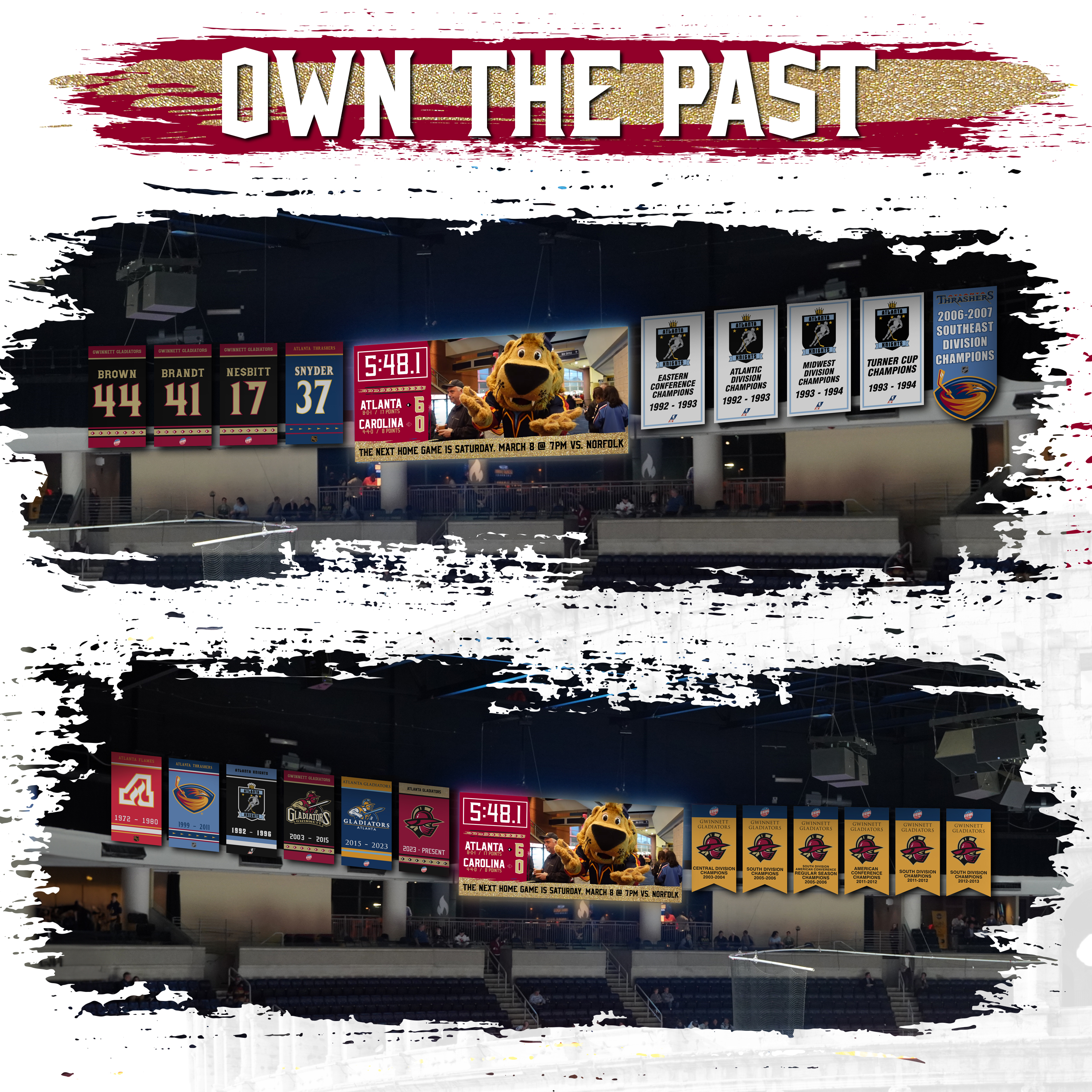
Several years back the Atlanta Gladiators updated their primary brand colors which I never was a fan of. So naturally I took a step back to “reboot” the entire brand as a fun side project similar to the Georgia Tech Brand Reboot that I completed previously. The original logos for the Gwinnett Gladiators were created by Joe Bosack and are still sharp marks 20 years later, so it was important to me to get the franchise back to their roots both with the original logos and colors.
Gone are the “new” colors, the live-traced logos, the Trajan typeface, and the inexplicable number of multiple uniform templates.
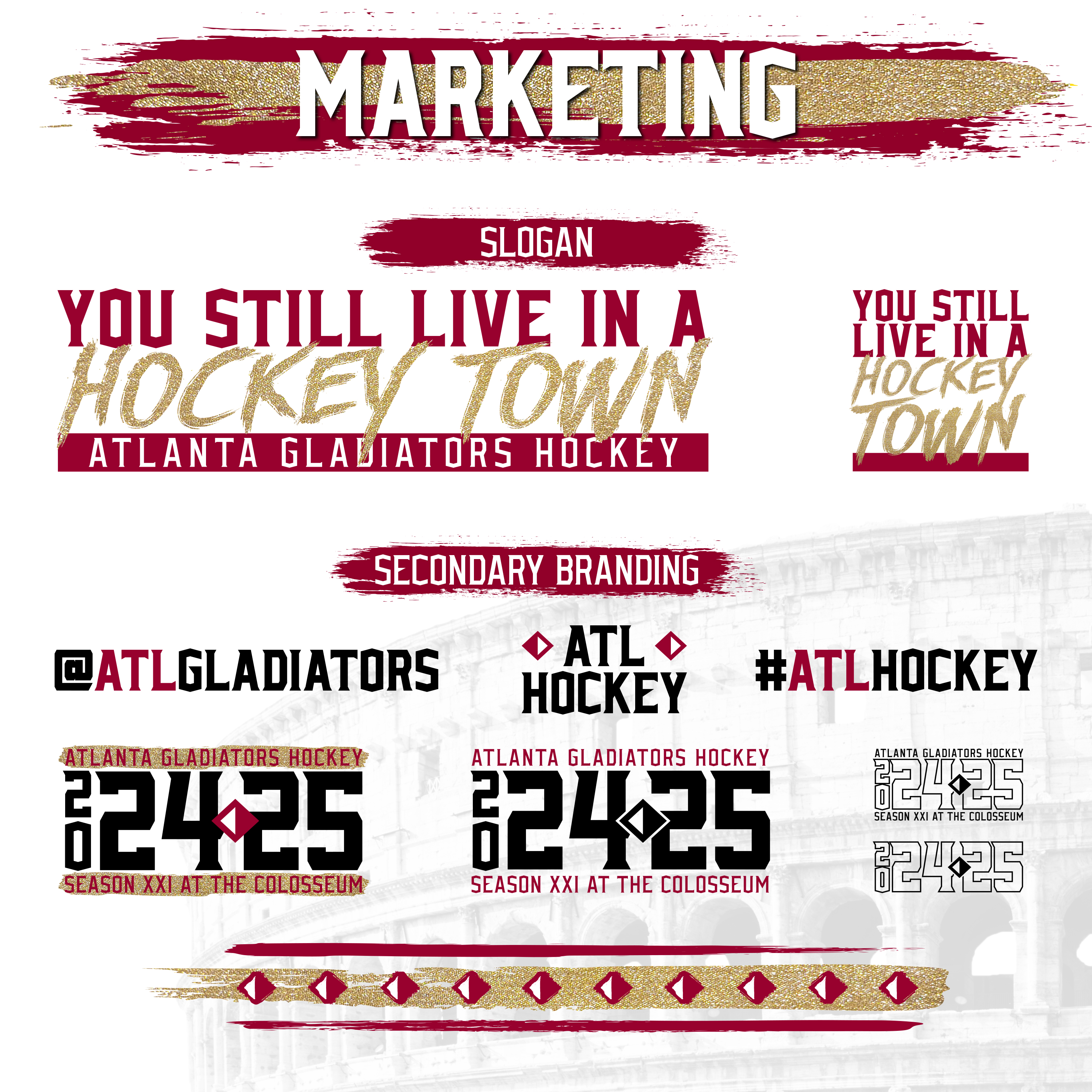
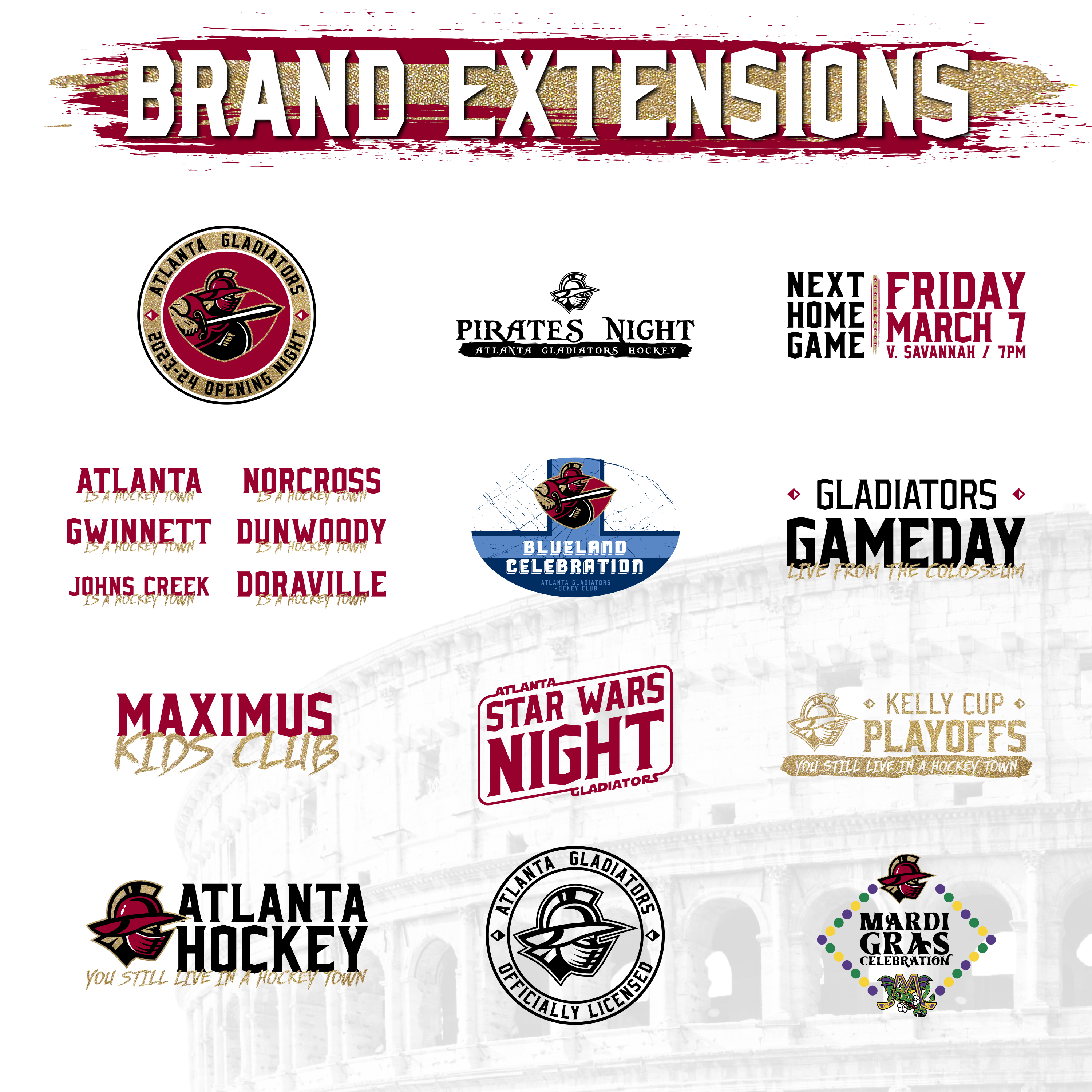
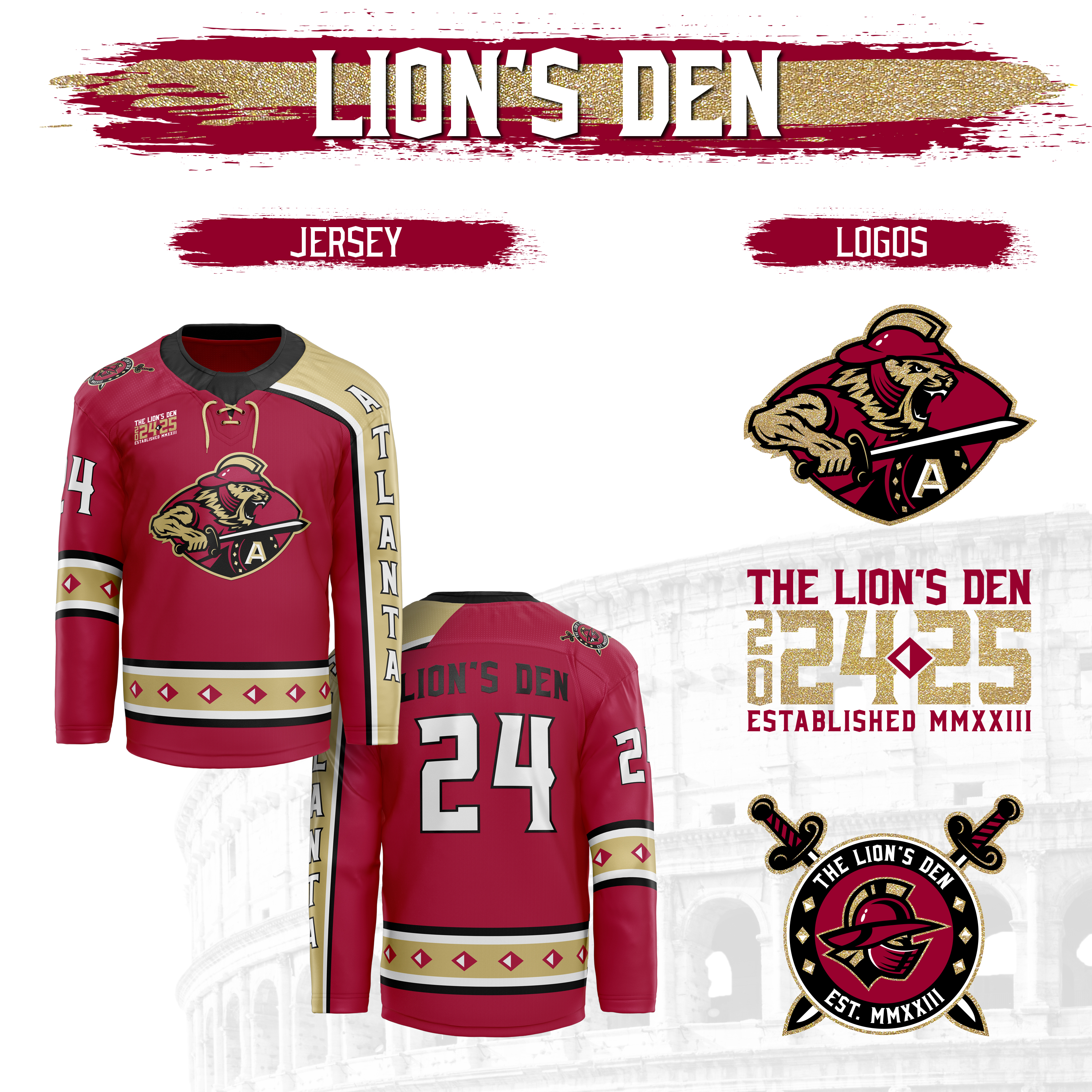
So what’s in? The correct colors, a nod to the city’s hockey past, a modernized typeface that is true to the original brand, uniforms that are uniform, Vegas-inspired textiles, and wall to wall branding at as many touch points as possible. I hope you enjoy!