Inner Development Counseling

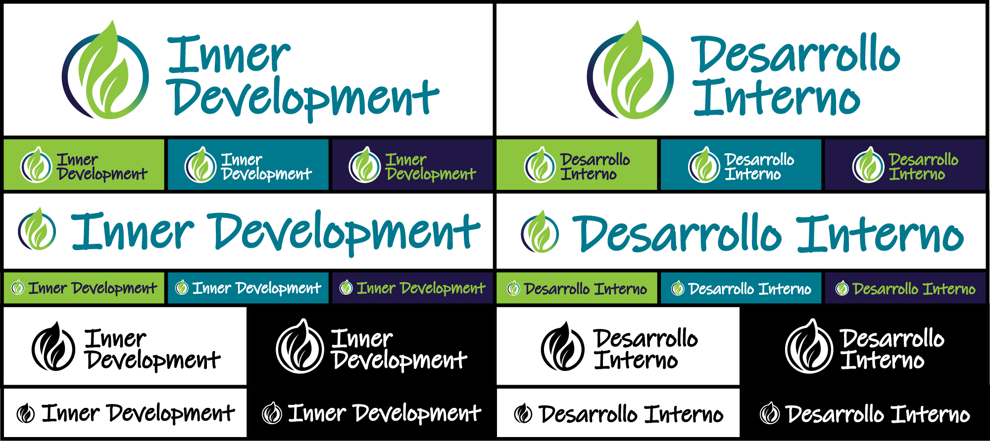
‘Inner Development’ is a family counseling practice incorporated in 2019. The primary focus of the practice is family and childrens’ counseling which helped inspired the dynamic, kid friendly color palette.

The primary mark is anchored by the icon logo to the left, with the stacked wordmark off to the right.
With the founder of the practice being bilingual, it made sense to incorporate a set of marks into the main brand that would assist in expanding the target market for potential clients.
A full suite of primary marks were created in both English and Spanish to help cover a variety of uses, including a horizontal mark for vertically tight applications to maximize the size and clarity of the mark. Black and White marks are also a part of the suite for select use when full color applications are not feasible.
Three variations of the primary icon logo are available for use depending on the logo application. The gradient based mark is preferred and ideal for most digital applications. In certain instances, the center spot color variation may be more appropriate for applications such as embroidery or molding. While not a preferred mark, the black and white version is also available for use if necessary.
The business cards were designed to emphasize the color palette, while clearly conveying basic services.

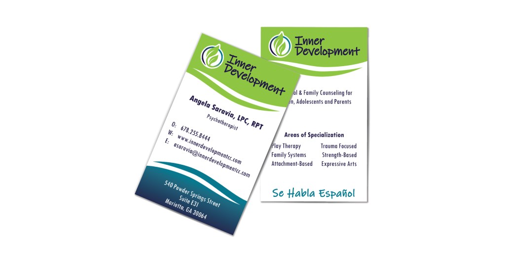
For more information on Inner Development, visit their site at innerdevelopmentcc.com!

Comments are closed.