This was a side project that I built for fun where I took Georgia Tech’s existing hodge podge brand as it existed in 2015, and evolved it to fit my vision of the standardized, yet dynamic brand that it was capable of becoming. I love feedback, so send it my way on the contact page! Enjoy!
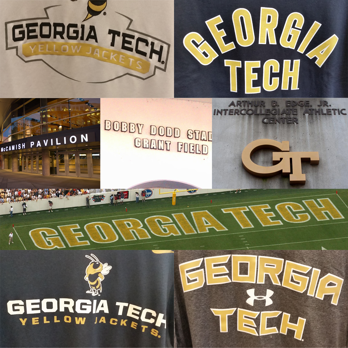
Georgia Tech has for years has struggled with inconsistent colors, as well as logo use. While the school colors are officially white and gold, the athletics department and institution as a whole have jumped around between dozens shades of gold and yellow, as well as bouncing back and forth between navy and black for the darker contrasting color. On top of the color inconsistencies, there are many different versions of the primary ‘GT’ mark which show up on merchandise, facilities, and digital, some of which are shown above. For the secondary ‘Buzz’ logo, there are also 3 different variations that have been seen “in the wild”: One that the school uses with a thicker stinger (2nd row, far left), one that is distributed to merchandise licensees (bottom left), and a third version which I believe is a bad attempt at Illustrator’s “Live Trace” feature that has also surfaced in the last few years (2nd row, middle. Also, see #BootlegBuzz).
Above are examples of the never-ending battle between the various shades of gold and yellow, as well as navy versus black. Are the official colors black and yellow? Navy and gold? Grey and cheddar? All of the above products have been approved by the Institute’s licensing program at some point or another, further adding to the confusion of what the colors are actually supposed to be. The University of Tennessee has one orange, and they own it. The University of North Carolina has one baby blue, and they own it. What is stopping Georgia Tech from picking a gold and ‘owning it?’
Some of the strongest brands in the country have a dedicated wordmark, or a certain style to their typography to further their brand beyond the primary & secondary logo marks. So for example, the wordmark in the endzone at Bobby Dodd Stadium should ideally match both the baseline wordmark at McCamish Pavilion and the wordmark on the dugout at Russ Chandler Stadium. Although variations within typography should be expected in a variety of applications on merchandise and other applications, the above examples are just a few of the inconsistencies found within a brand without any oversight.
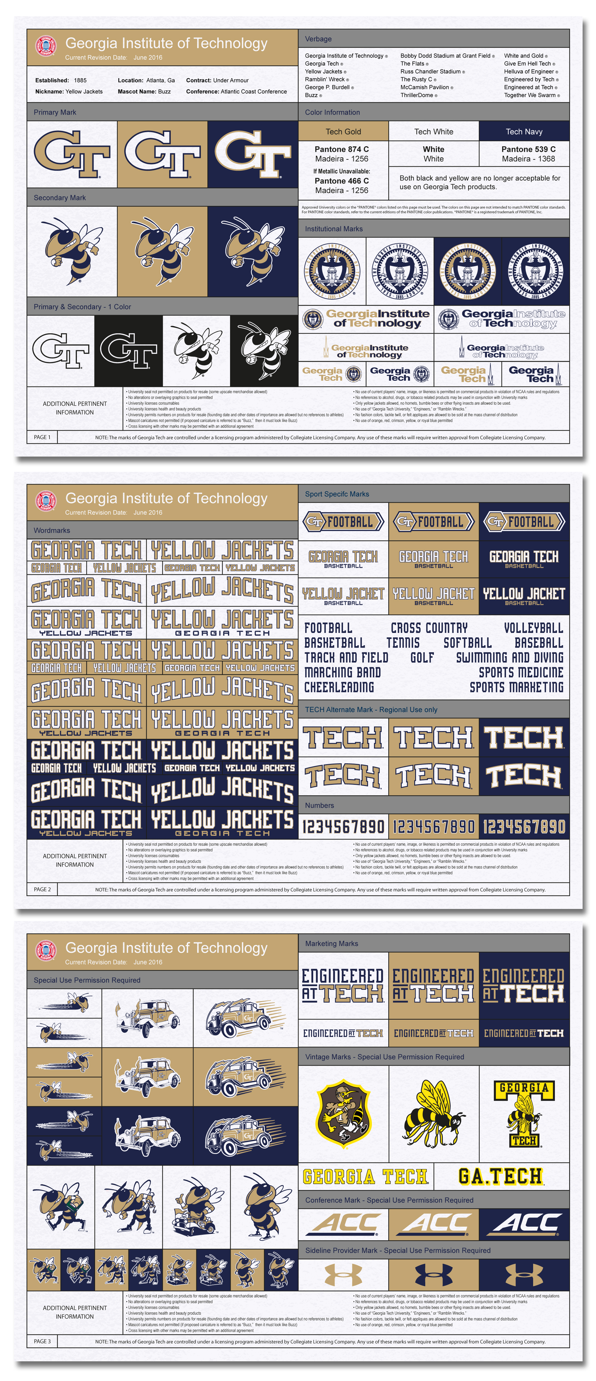
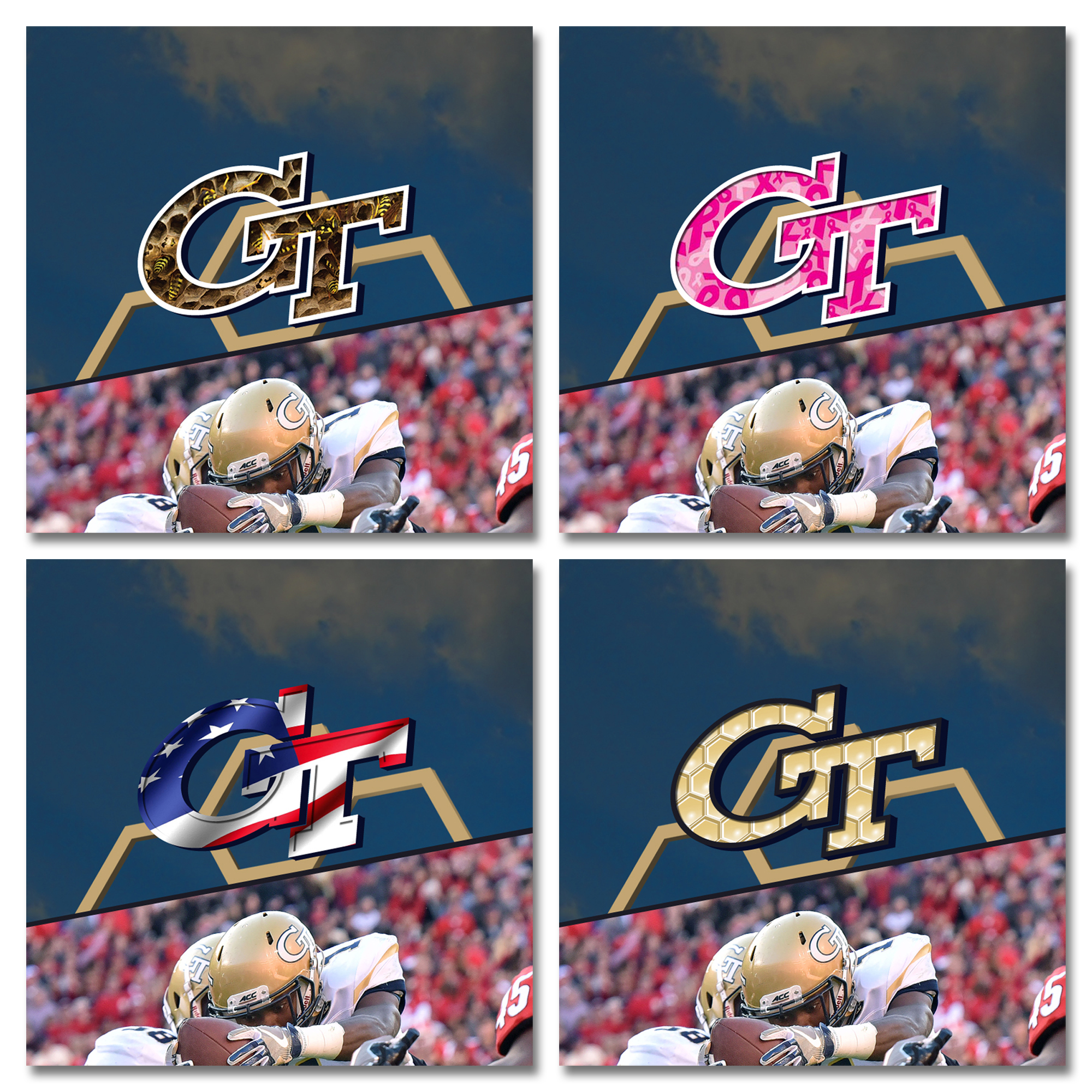
To start things off, here’s a new style guide I created based off of the existing licensing program. This style sheet establishes a unified color palette (gold and white with minimal use of navy), as well as identifies the proper usage of all marks. Most of the logos are from the existing logo sheet (as of 2016), but recolored and standardized so that all marks can live and work together. A major flaw of the current logo sheet is that most marks have 2 versions: One with gold & navy, and one that is cheddar yellow & navy (but sometimes black because why not?). Along with streamlined logo offerings in a unified color palette that is properly encouraged and actively enforced, a typographic system has been introduced on the second page to further extend the visual brand. This type would cover all athletic team uniforms, collateral, facility signage, and other assorted uses as called upon. On the third page you will find conference marks, sideline provider marks (Anything is better than Russell, right?), and new marketing verbiage that will also be in play.
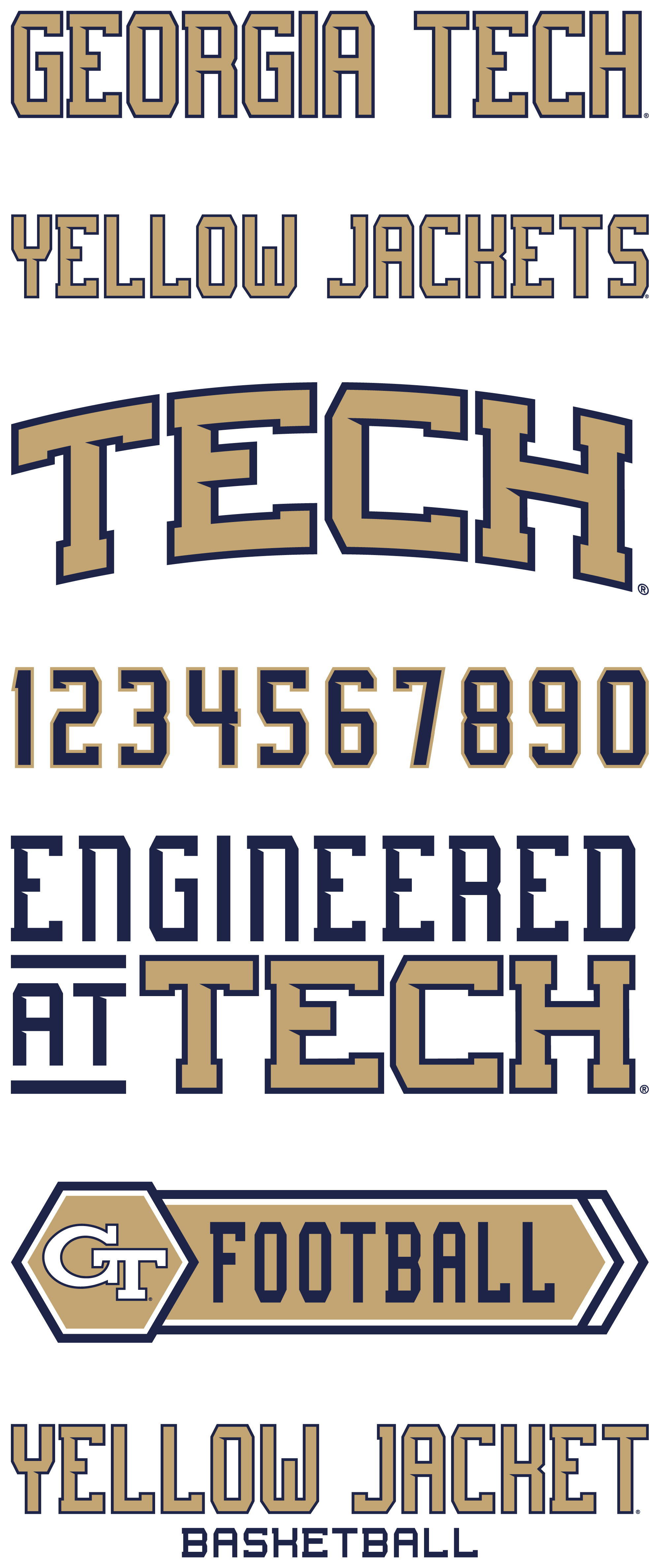
The major addition to the brand in this project is dedicated typography. This system is based on Adam Eargle’s Grizzly 0116 font (Go check out his work!). With some minor character changes, it quickly establishes a brand consistency across all athletic department stakeholders. Included with the typeface is a matching number system to be used on all athletic competition jerseys. With a longer school name (GEORGIA TECH) and an even longer mascot name (YELLOW JACKETS), the lettering must be carefully balanced out to make sure that the wordmarks are legible in a variety of uses. If the lettering is too tall and skinny, it will be illegible, while on the opposite end of the spectrum if it is too wide and fat, it will take up too much room horizontally and be unusable.
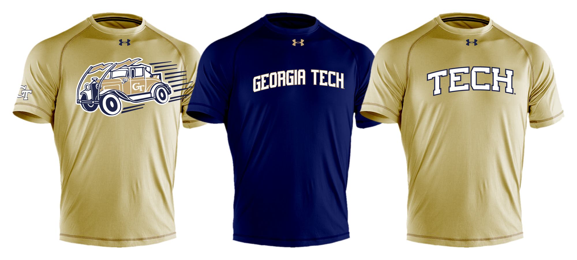
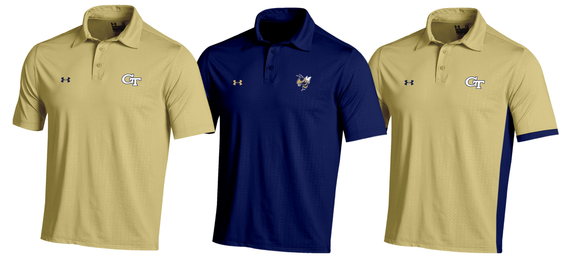
These are some examples of new merchandise that would be created using the new branding standards and new sideline provider.
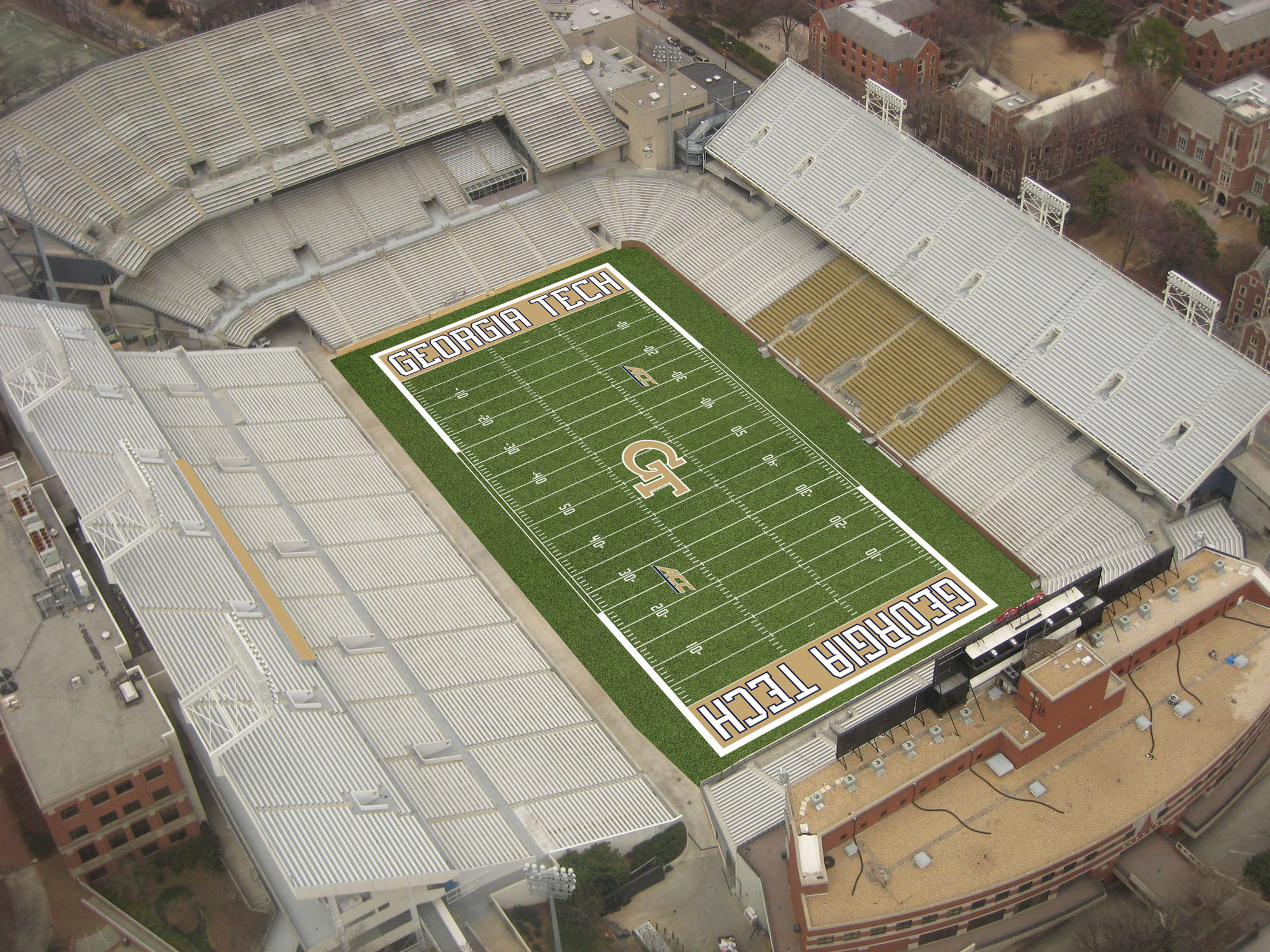
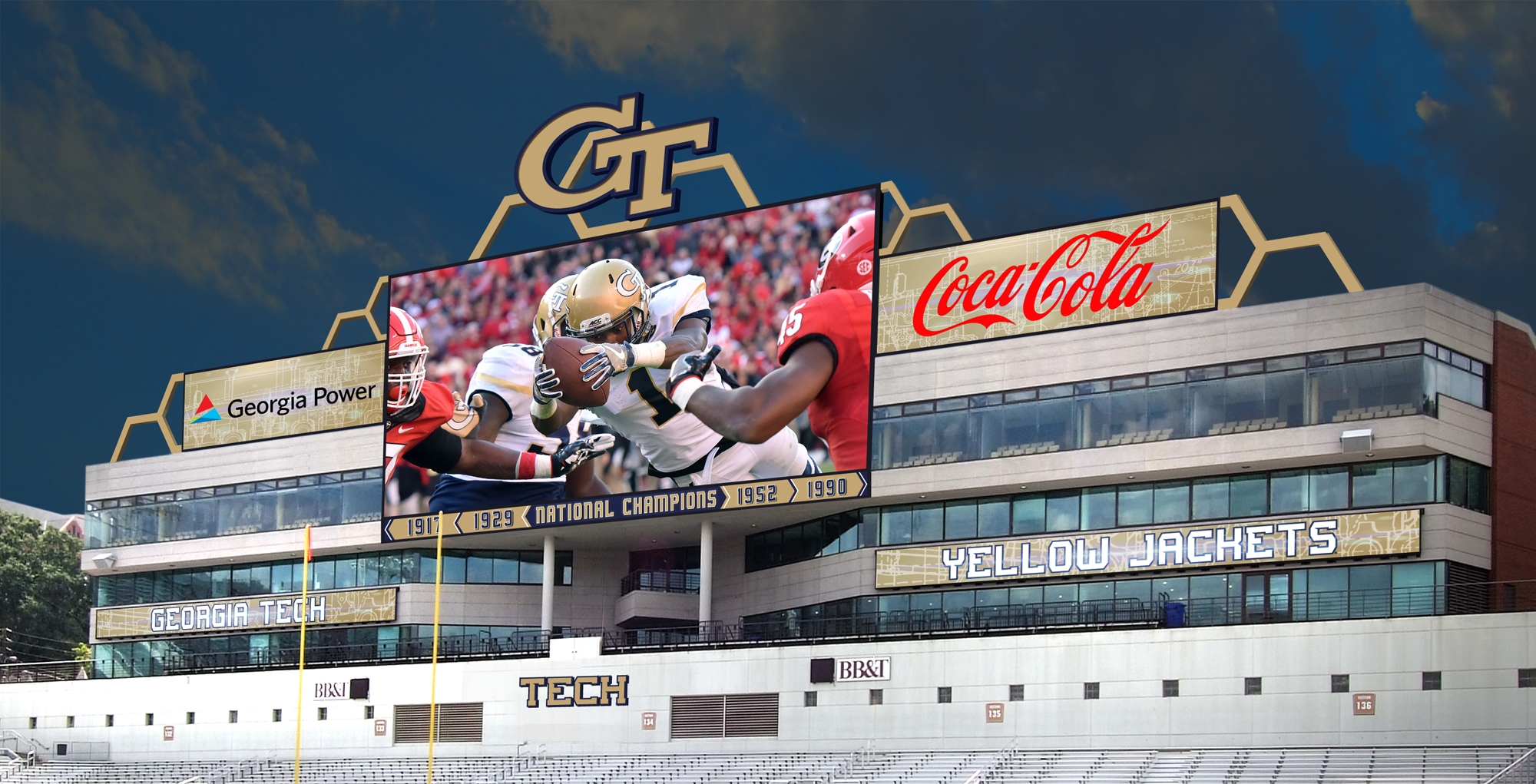
The new branding as applied to Grant Field.
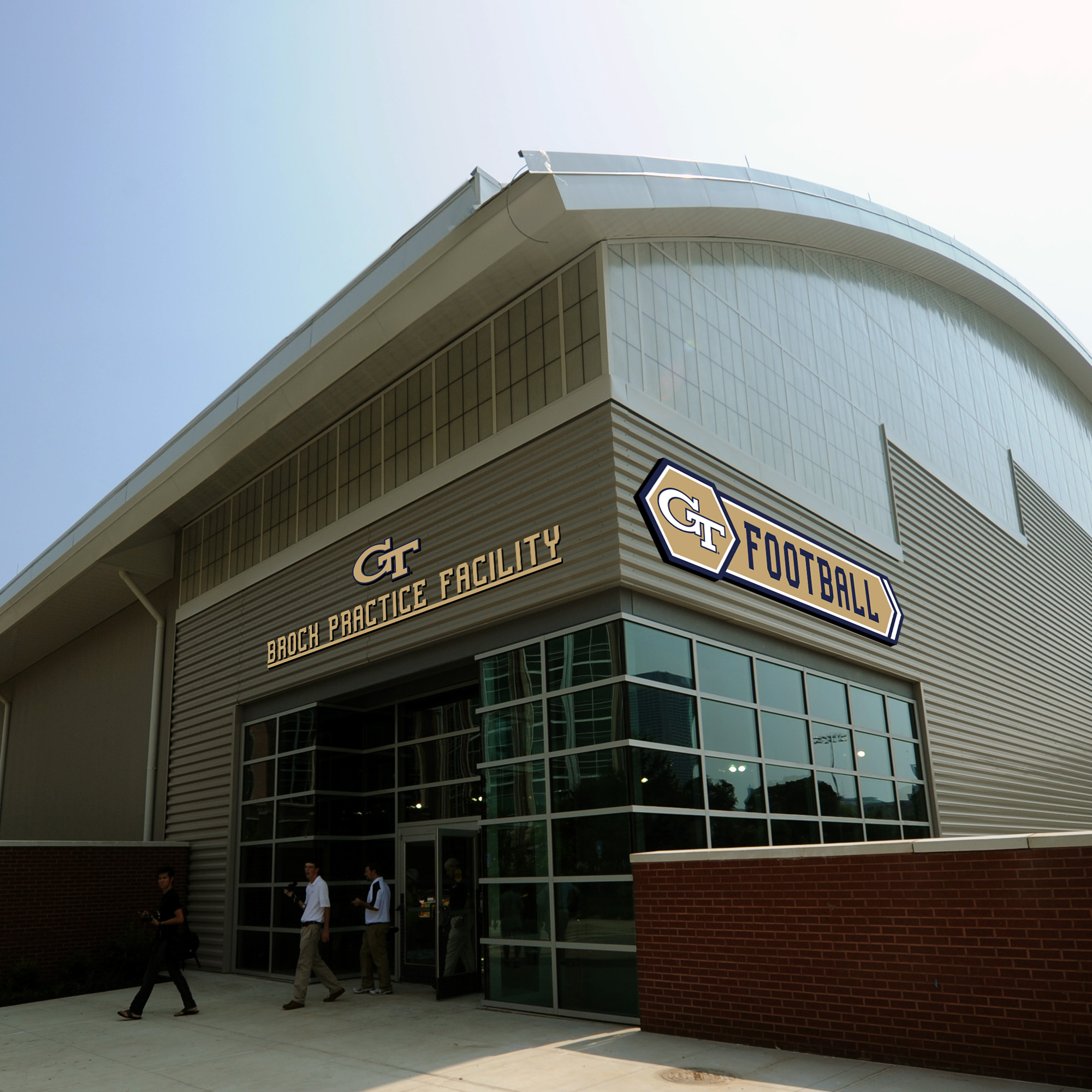
New facility signage would feature sport-specific logos and the new typeface used in conjunction with the traditional primary logo. Consistent typography across all athletic facilities would help strengthen the brand across campus and carry over into Midtown.
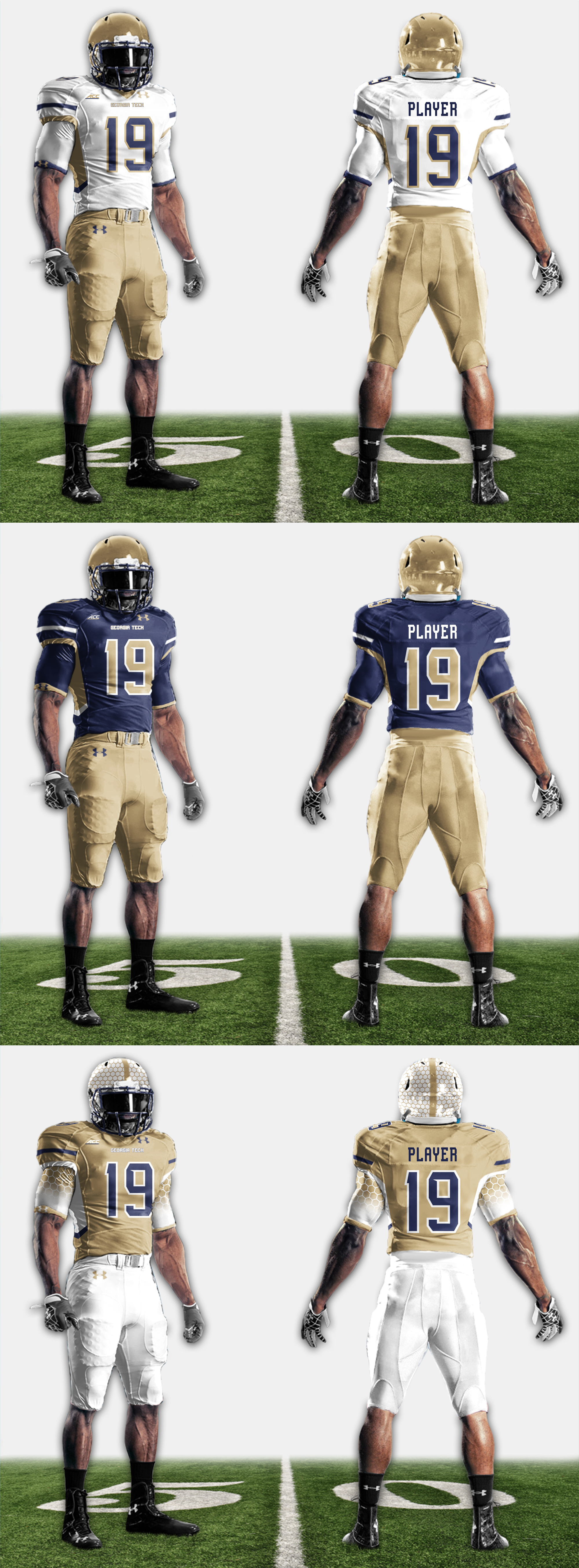
This is an example of how the brand would be applied to athletic uniforms. Elements from the style guide are reinforced such as the color balance and fonts. The top jersey would be the primary home/away combination, with the middle being a ‘big game’ jersey, and the bottom being an occasional alternate used only to block an opponent from wearing red jerseys on the Flats.
As part of the branding roll out, matching scoreboard graphics, and updated signage would be installed throughout all athletic facilities. The honeycomb pattern would be utilized in moderation to provide support to the Yellow Jacket brand.The ‘GT’ logo on top of the scoreboard would also be a large, custom shaped LED video board, which would be used in moderation for key graphics, events, and game situations, but never advertising or in a non-brand color like red or orange.
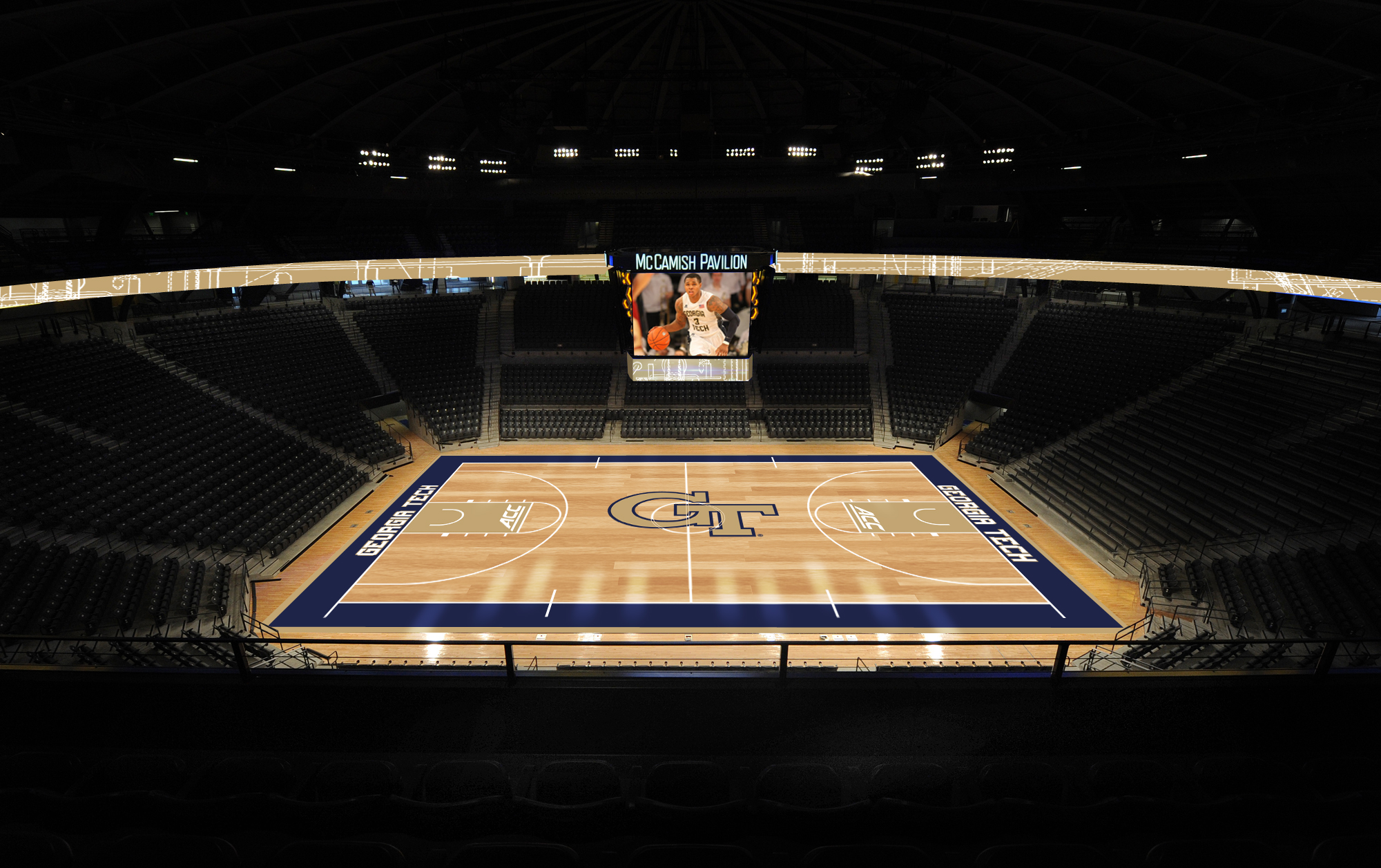
This is the new brand as applied to Cremins Court at McCamish Pavilion.
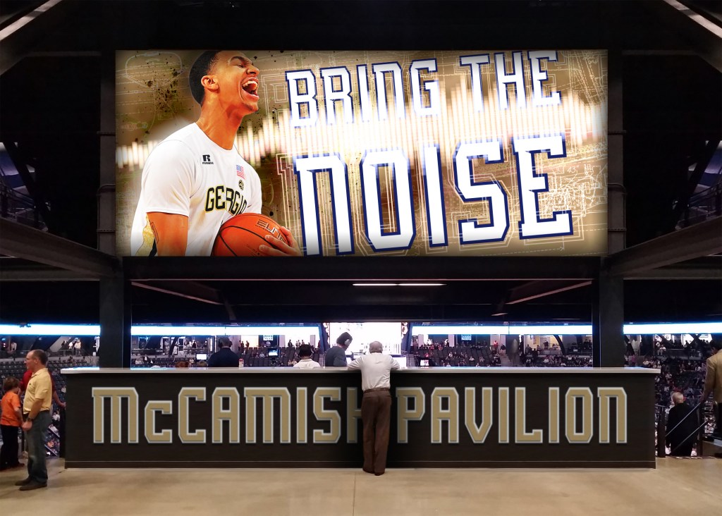
This is the large (currently underused) graphic that would greet fans just inside the main doors of McCamish Pavilion. Also included are over-sized signage to further emphasize the home-court advantage, and provide a photo opportunity for fans.
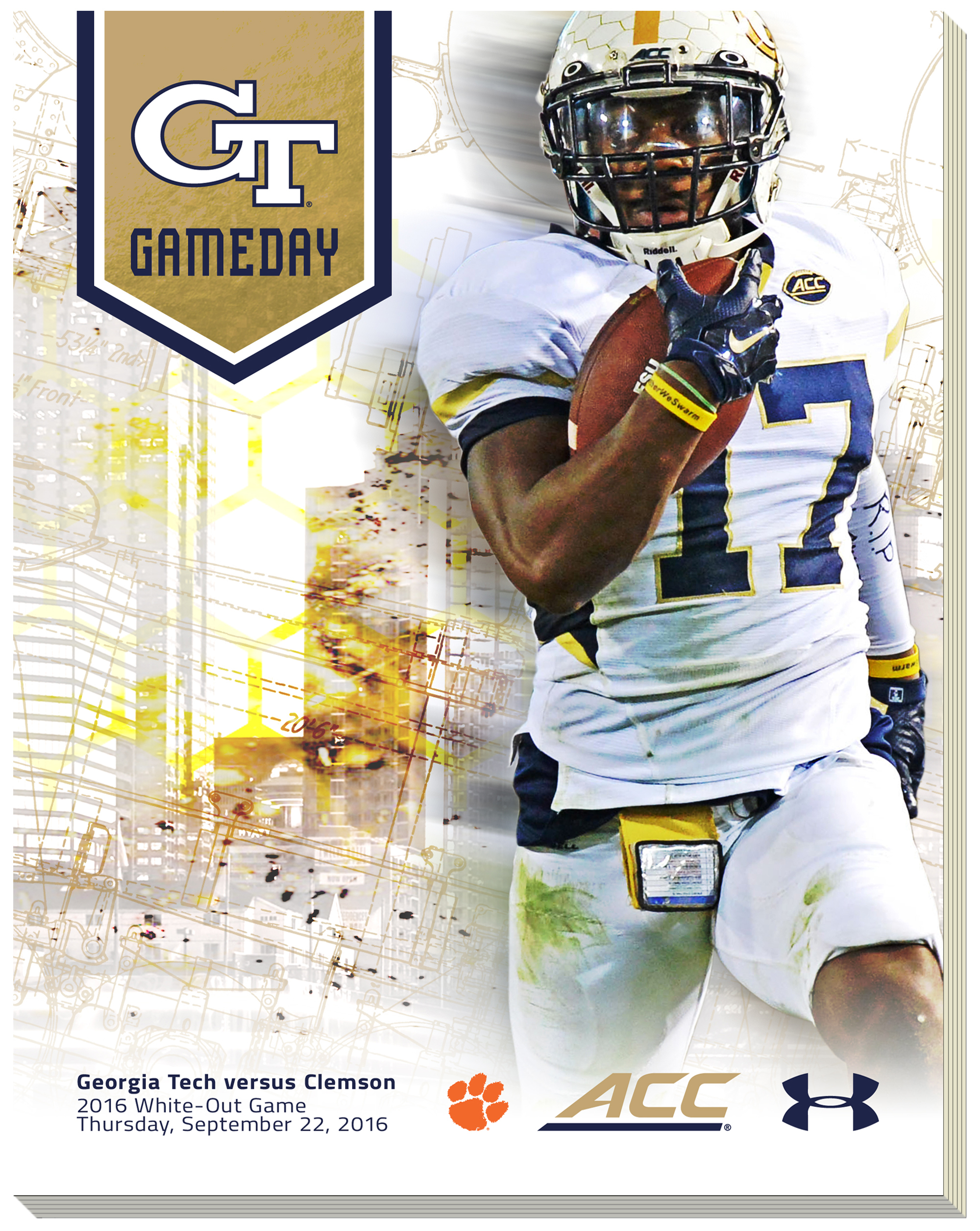
This is an example of a Gameday program cover. The cover reinforces the primary typeface, while introducing a secondary typeface for body copy. Also included in the design are subtle images of the Atlanta skyline, the honeycomb pattern, as well as old steam engine blueprints as a call back to the institute’s founding. Most materials would stress dynamic photography as the focal point as seen above.
In this example, the new visual brand typography, logos, and photographic style are applied to physical football tickets.
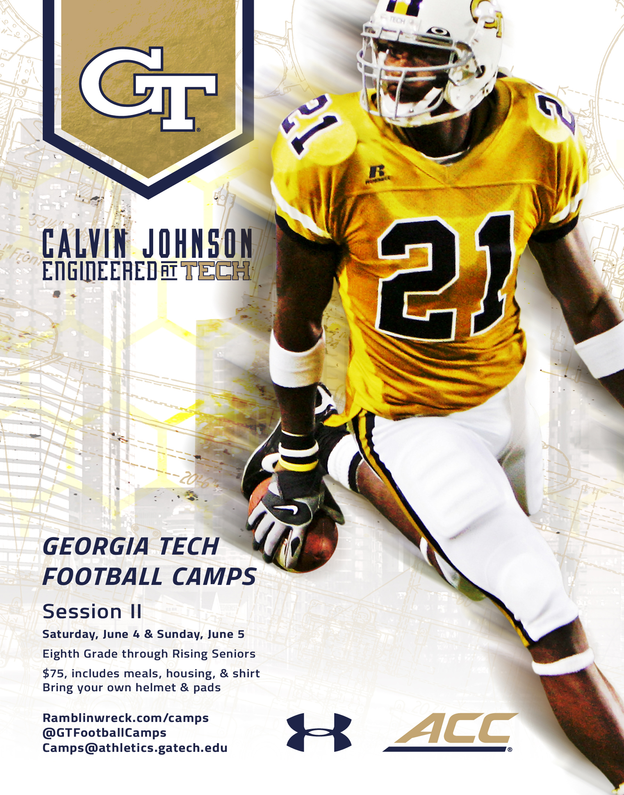
Here’s an example of a poster advertising summer football camps. Like the Gameday program, the poster focuses on a main hero image, while providing the relevant information in the column to the left.
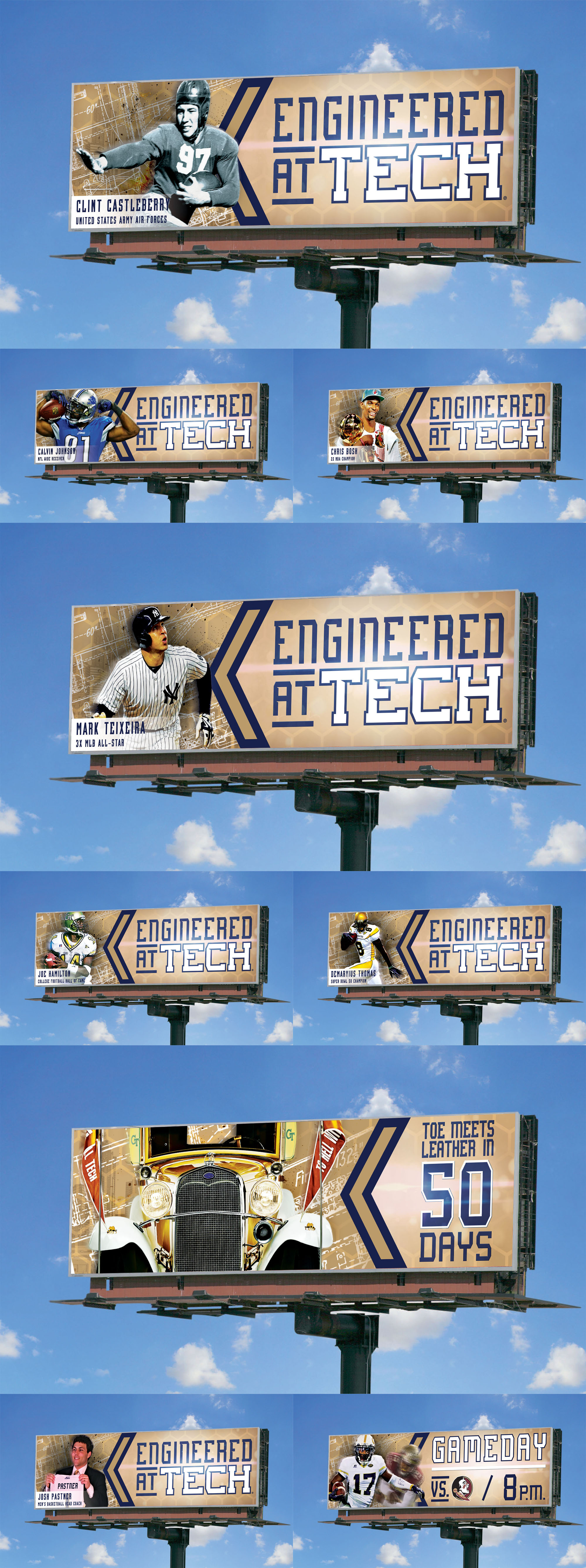
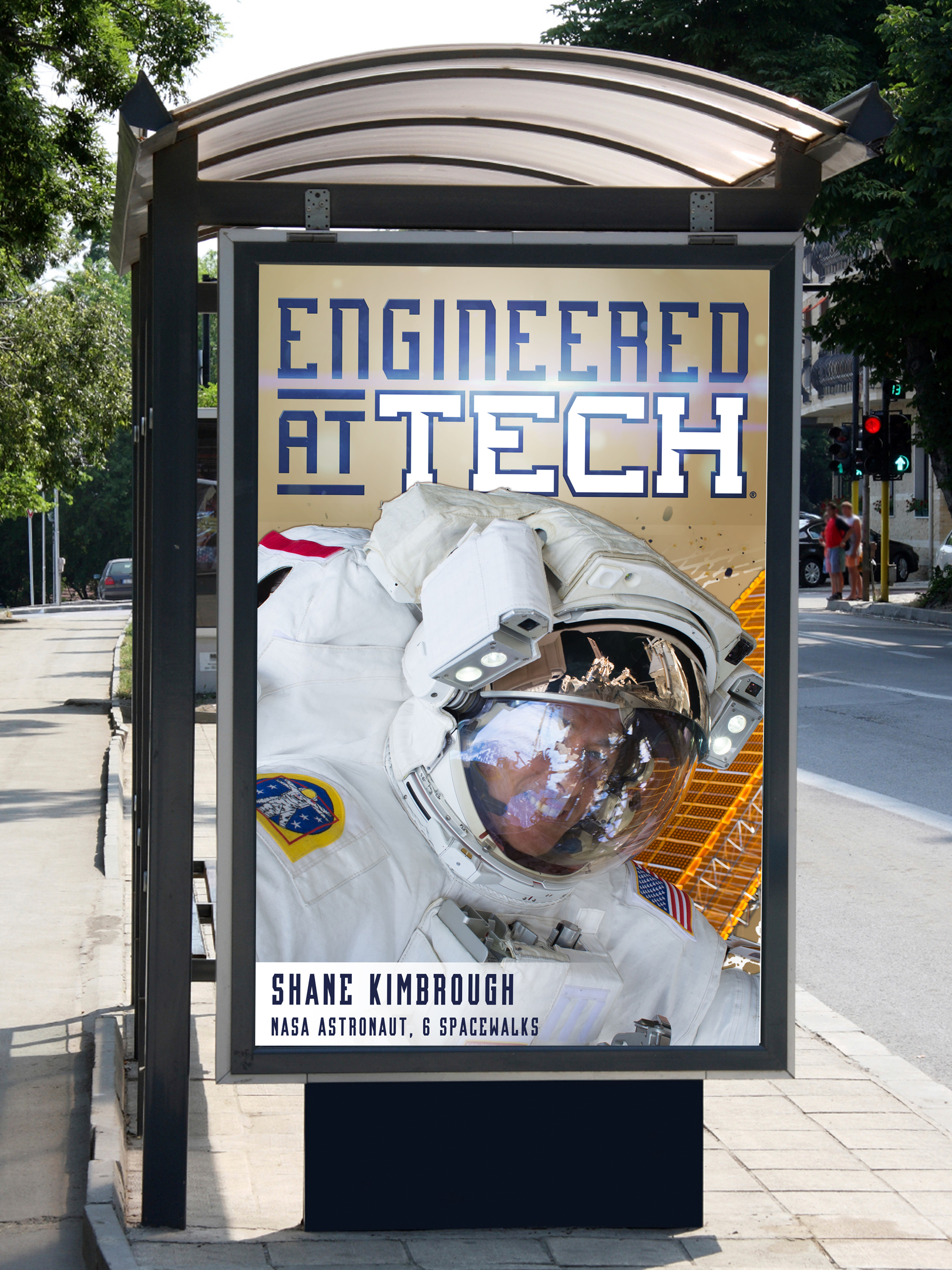
To further the ‘Engineered at Tech’ marketing initiative, strategically placed billboards around the metro area would feature former student-athletes, traditions, and moments. These branded billboards would also feature gameday announcements, countdowns, ticket information, and other promotional material to energize the local fan base throughout the metro area.
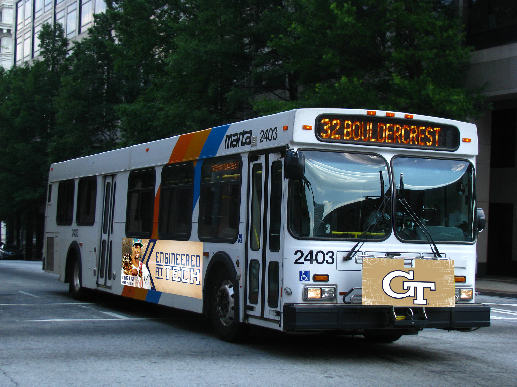
Here’s the static billboard advertising campaign as applied to mass transit mobile billboards.To tie in with the advertisements on MARTA buses, select bus stops on targeted routes would be sponsored to further extend the campaign. This example focuses on a famous alumni versus an athletic figure.
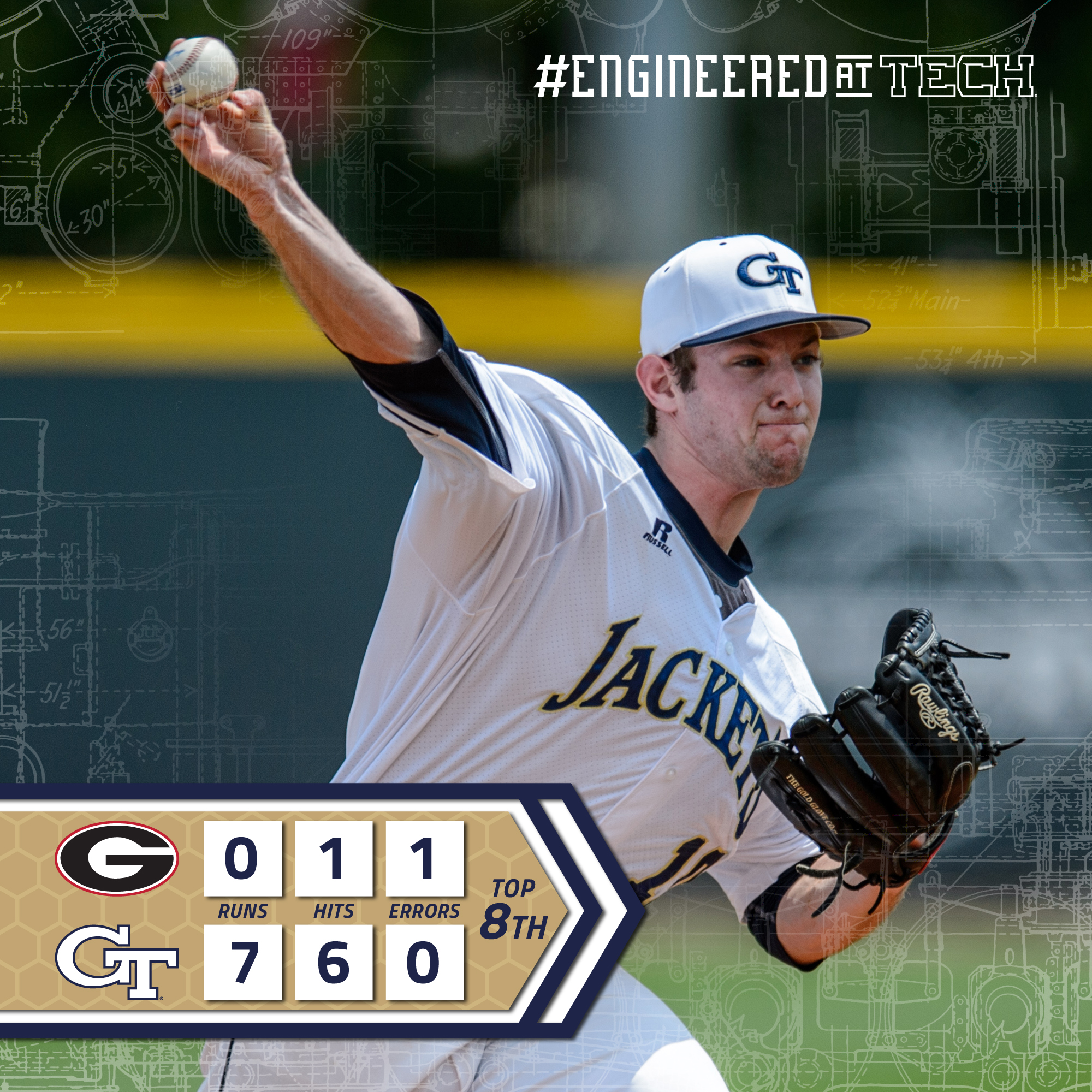
This is an example of an in-event social media post. The basic, easy to use template would be implemented across all sports.